Fixdata
Client: Fixmart · Sub-brand identity system · Brochure, pull-up banner, exhibition stand
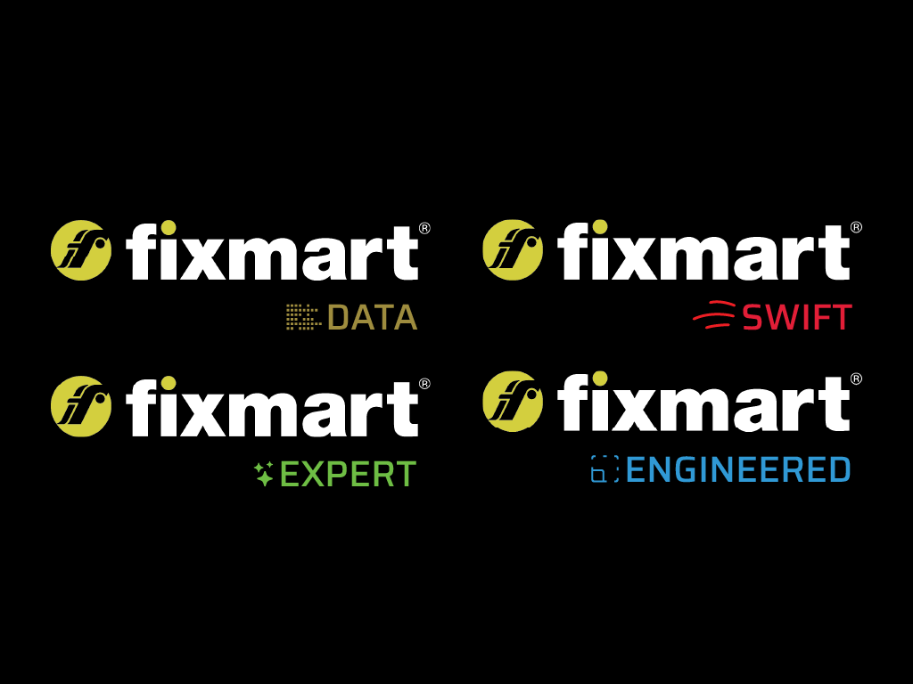
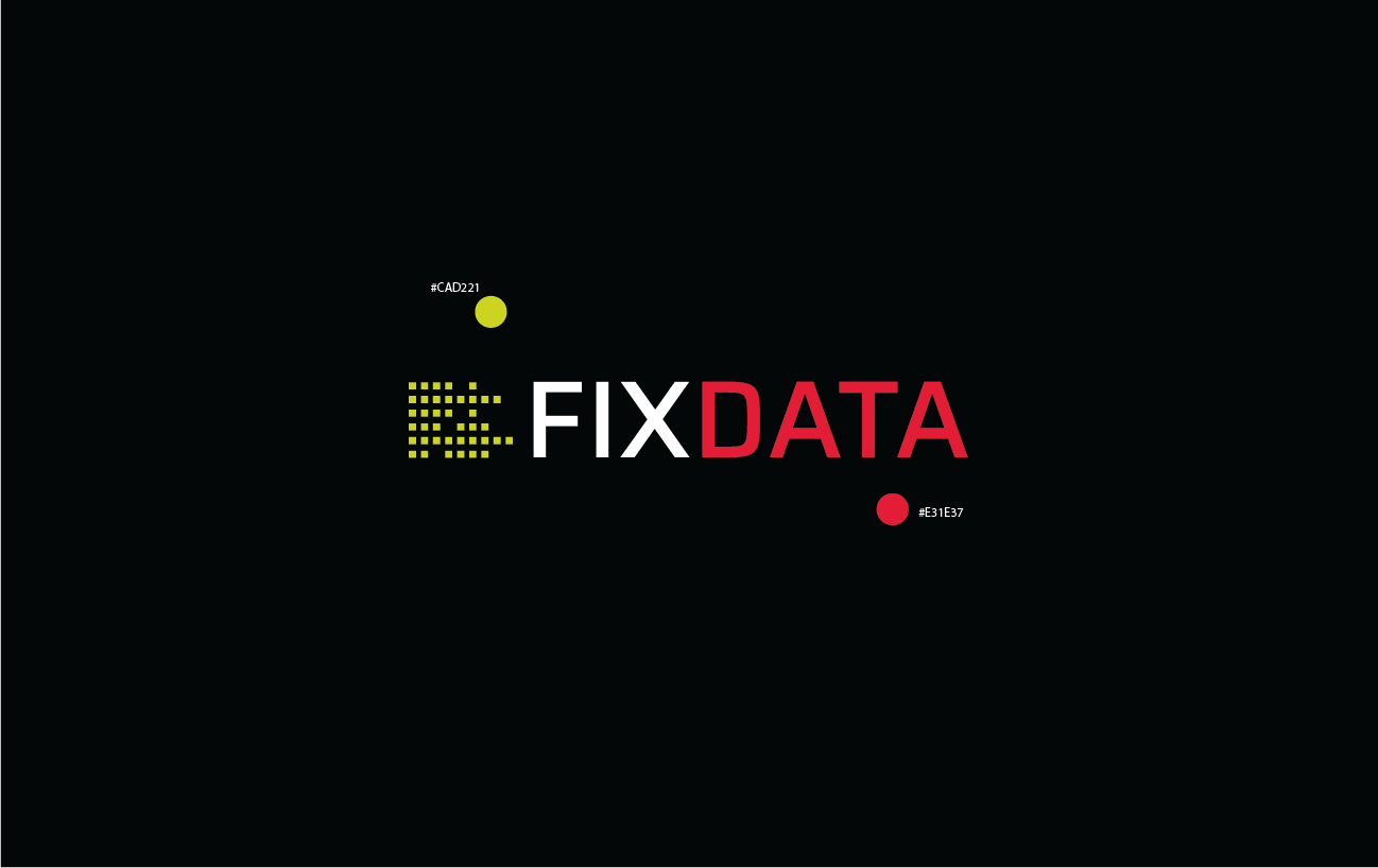
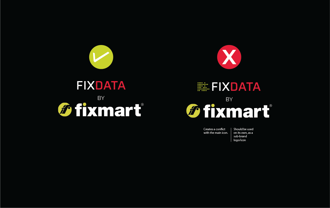
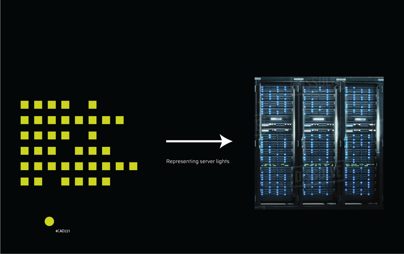
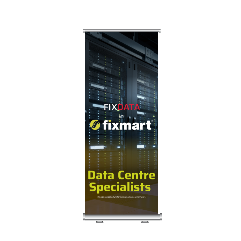
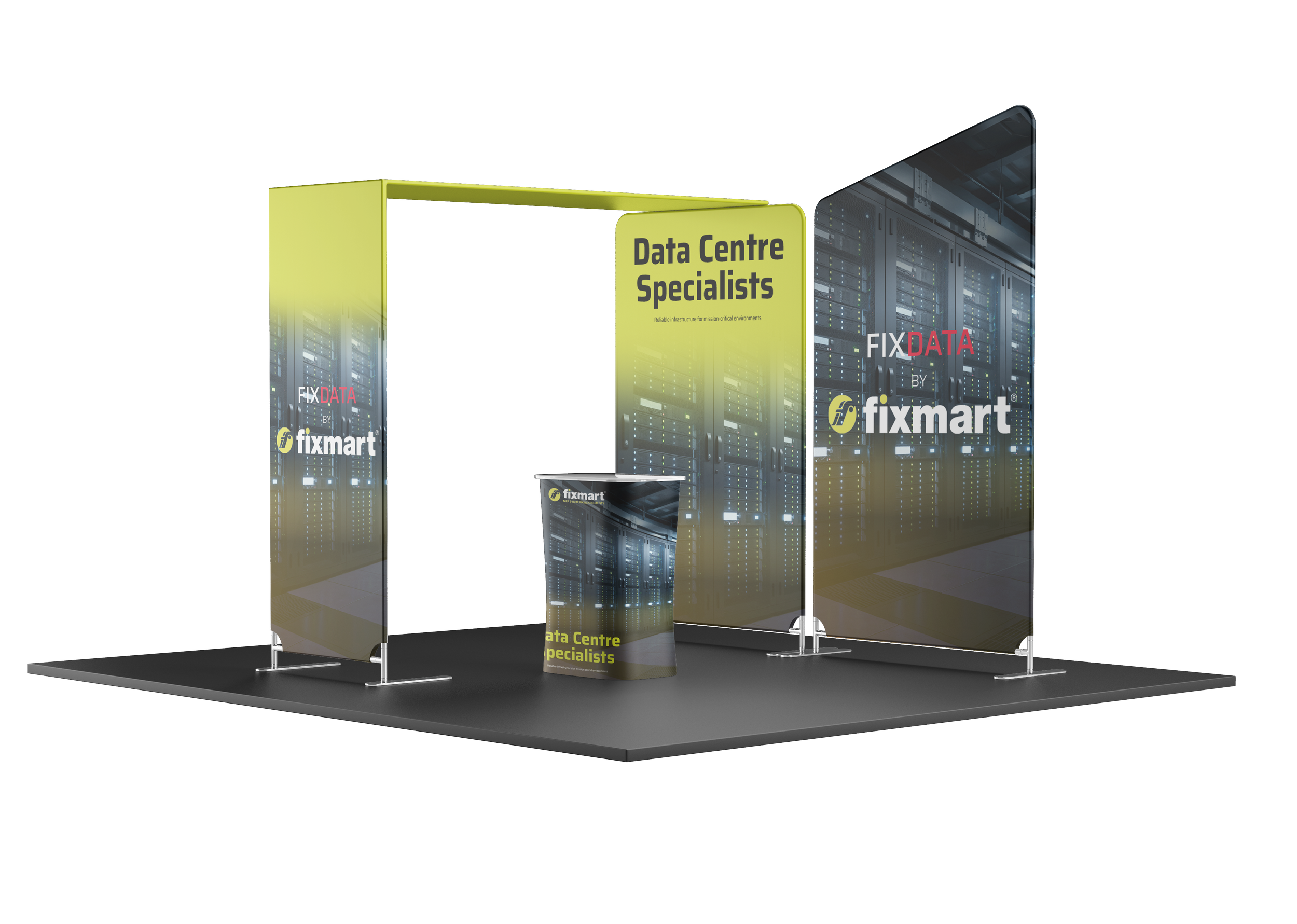
A subtle sub-brand lozenge developed to communicate Fixmart’s growing expertise in the Data Centre sector without diluting the core brand. The concept explored clean, technical visual language, shared typography, and restrained contrast colours to ensure Fixmart remained the primary brand while clearly signalling specialist capability. Designed for flexibility across brochures and exhibition graphics, the solution enhances credibility with MEP, HVAC, and main contractors while maintaining strong brand continuity.
Signal specialist Data Centre capability at a glance
Maintain brand hierarchy with Fixmart as the hero brand
Avoid fragmentation or the appearance of a standalone brand
Ensure flexibility across marketing touchpoints


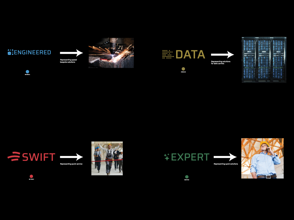
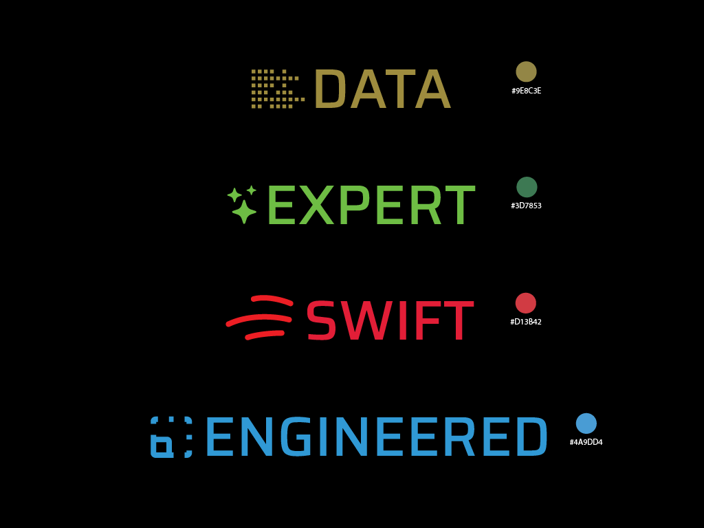
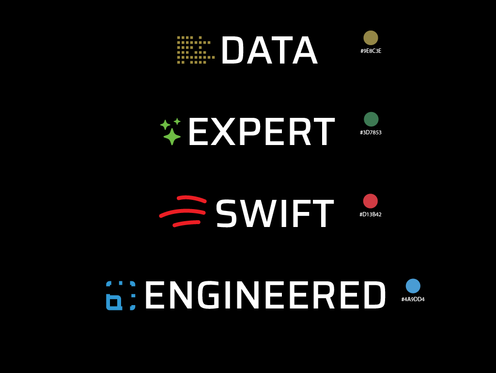
The wider system: Key Services sub-brands
Self-initiated concept
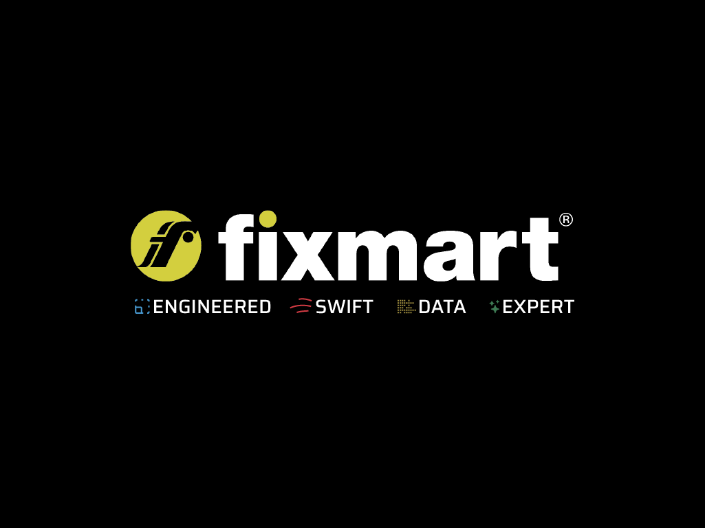
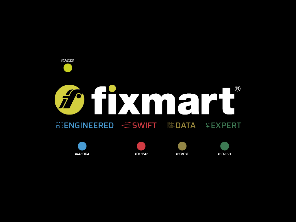
A suite of subtle sub-branding lozenges developed to highlight Fixmart’s key service areas while preserving the strength of the core brand.
Design Challenges & Considerations:
Differentiating multiple specialist services without fragmenting or diluting the Fixmart brand
Maintaining clear brand hierarchy with Fixmart as the primary identifier
Creating a technical, credible aesthetic appropriate for MEP and HVAC audiences
Ensuring flexibility across brochures, exhibition graphics, and large-format applications
Design Solution:
Consistent use of Fixmart typography to maintain brand continuity
Clean, modern visual language aligned with technical expertise
Subtle contrast colours to clearly signpost services without overpowering the master brand
Scalable lozenge system adaptable across marketing touchpoints
The resulting sub-branding enhances clarity, service recognition, and credibility while reinforcing Fixmart’s position as a specialist contractor within the MEP and HVAC sectors.